Ando Money Case Study
Overview
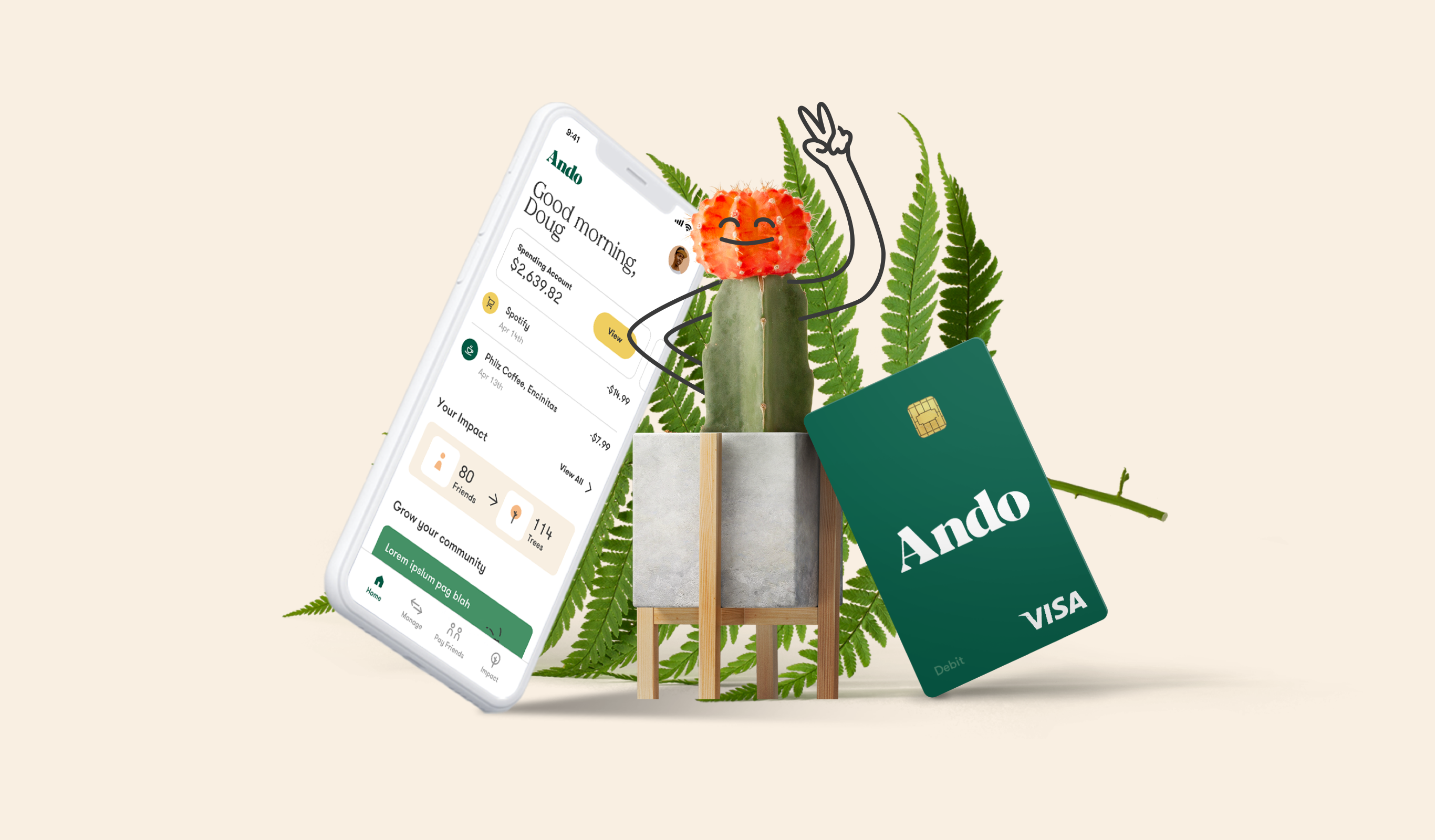
After Ando launched a brand new mobile banking product, Users needed new competitive features that would increase conversions and retention.
Primary Contributions:
Visual Design
Product Design
Role:
Senior Visual Designer
Credits:
Created at Ando Money
Website: andomoney.com
App: Ando Money App
Approach
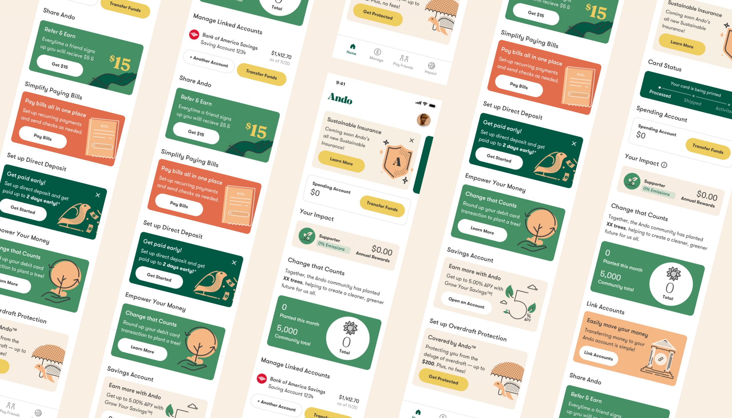
After an extensive competitor analysis and business direction from the executive team, a few questions began to emerge around our feature set. I would help solve the following:
• How might we offer a higher savings rate to convert more users and retain existing users?
• How might we offer a referral program where users could earn rewards by inviting friends?
• How might we reimagine our impact center to show users how they could earn cash while also doing good for the environment?
We also began to evaluate our homescreen experience and how all the featured cards worked together throughout the user journey as we added new features.
Grow Your Savings Feature
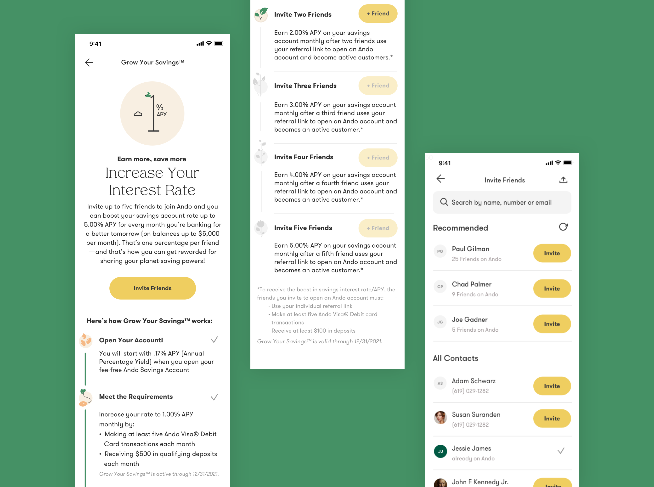
We were tasked with launching a new feature that would increase a user’s savings rate as certain requirements were completed, up to 5% APY.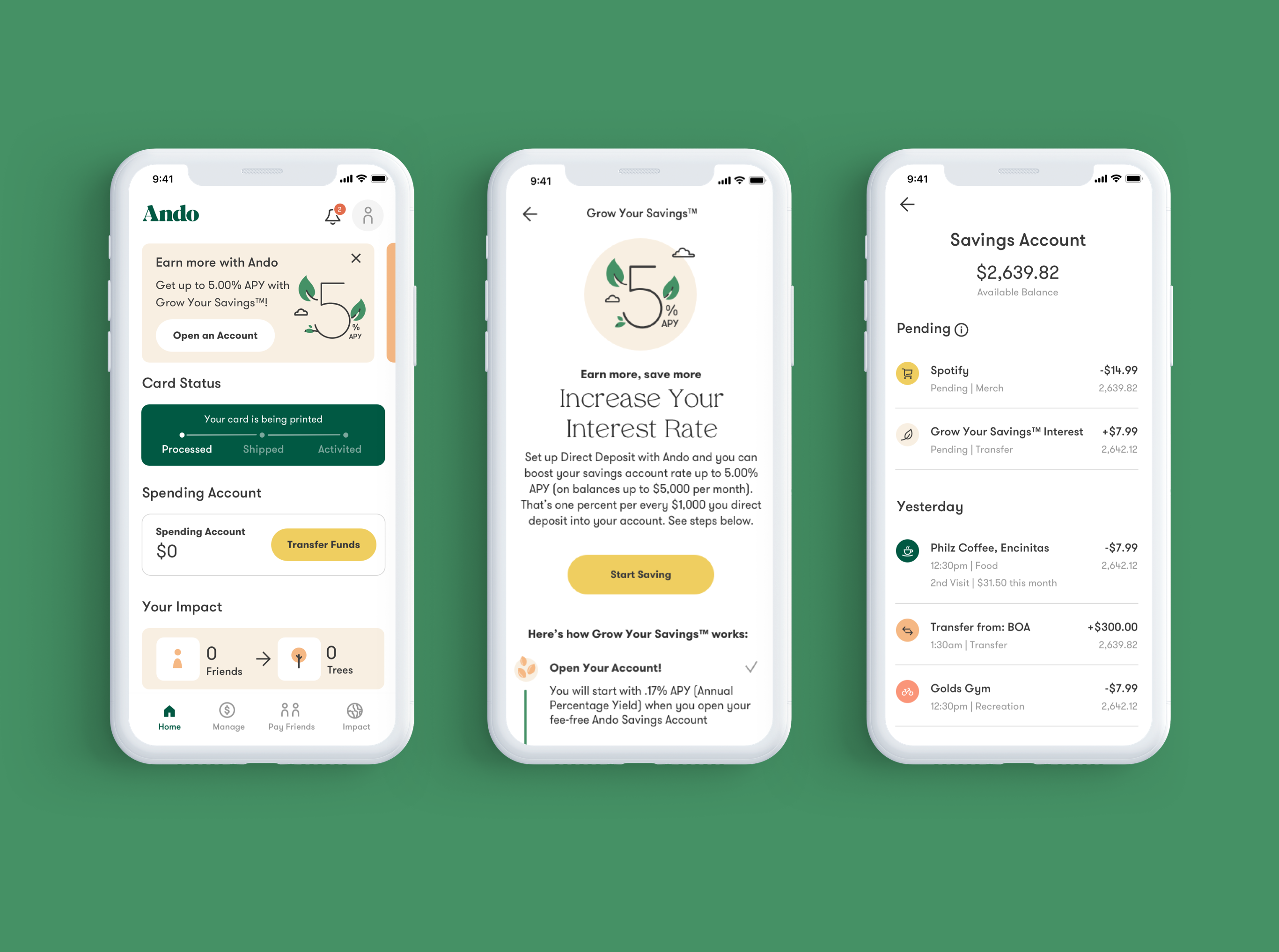
• I am a new user and I am interested in how I can increase my savings account interest rate
• I am an existing Ando user without a savings account
• I am an existing Ando User who has already used a Savings Account
• I am an Ando User who is participating in this new program and I want to know the status of my savings boost
These scenerios helped identify deliverables including onboarding updates, homescreen carousel and dashboard updates, dedicated app landing screen with additional states, in-app notifications, and product emails.

Our copy team began brainstorming names for this new feature and landed on the name Grow Your Savings. We then concepted a look and theme that would would help differentiate it from other features in the app. We played into this plant theme and began to design elements like these custom animated svgs above.
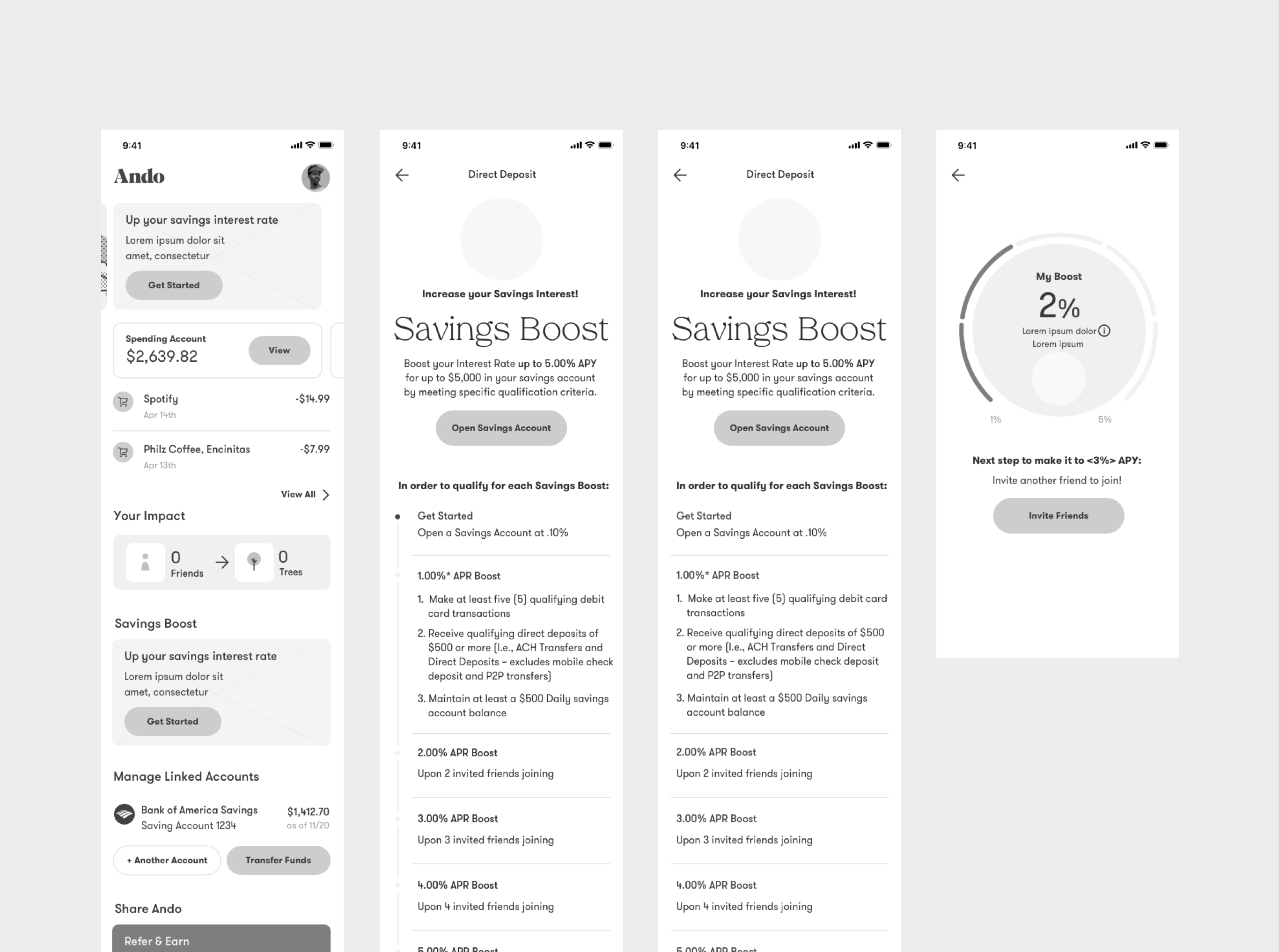
Initial Wireframe Concepts
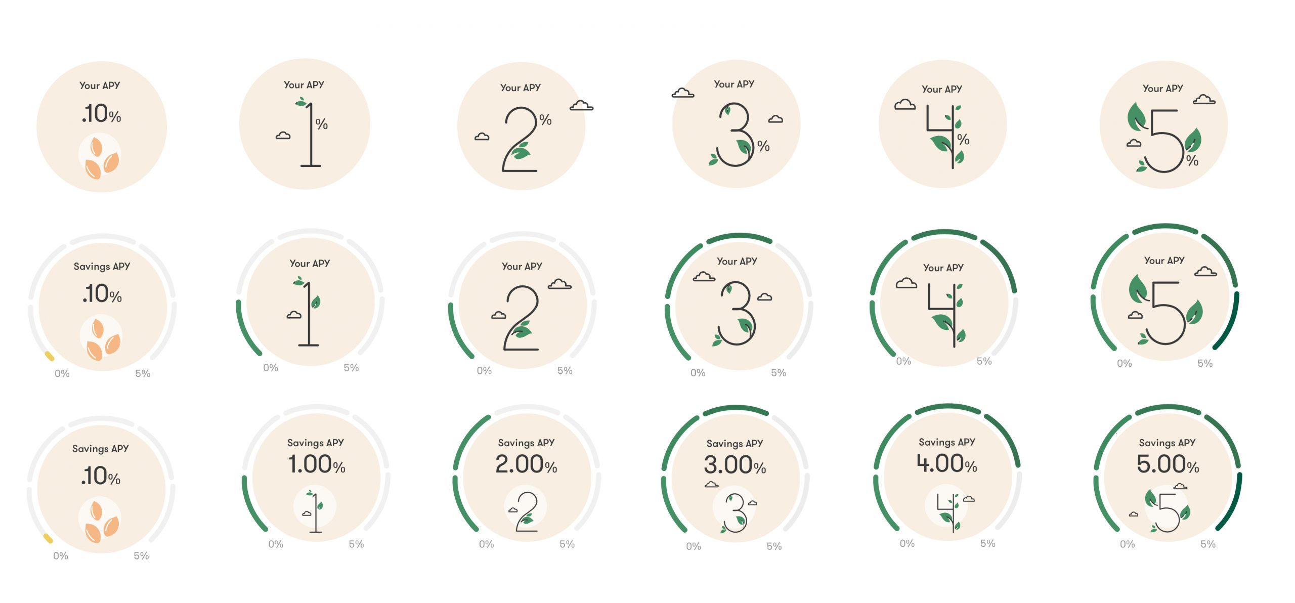
Icon Explorations

Additional Insights
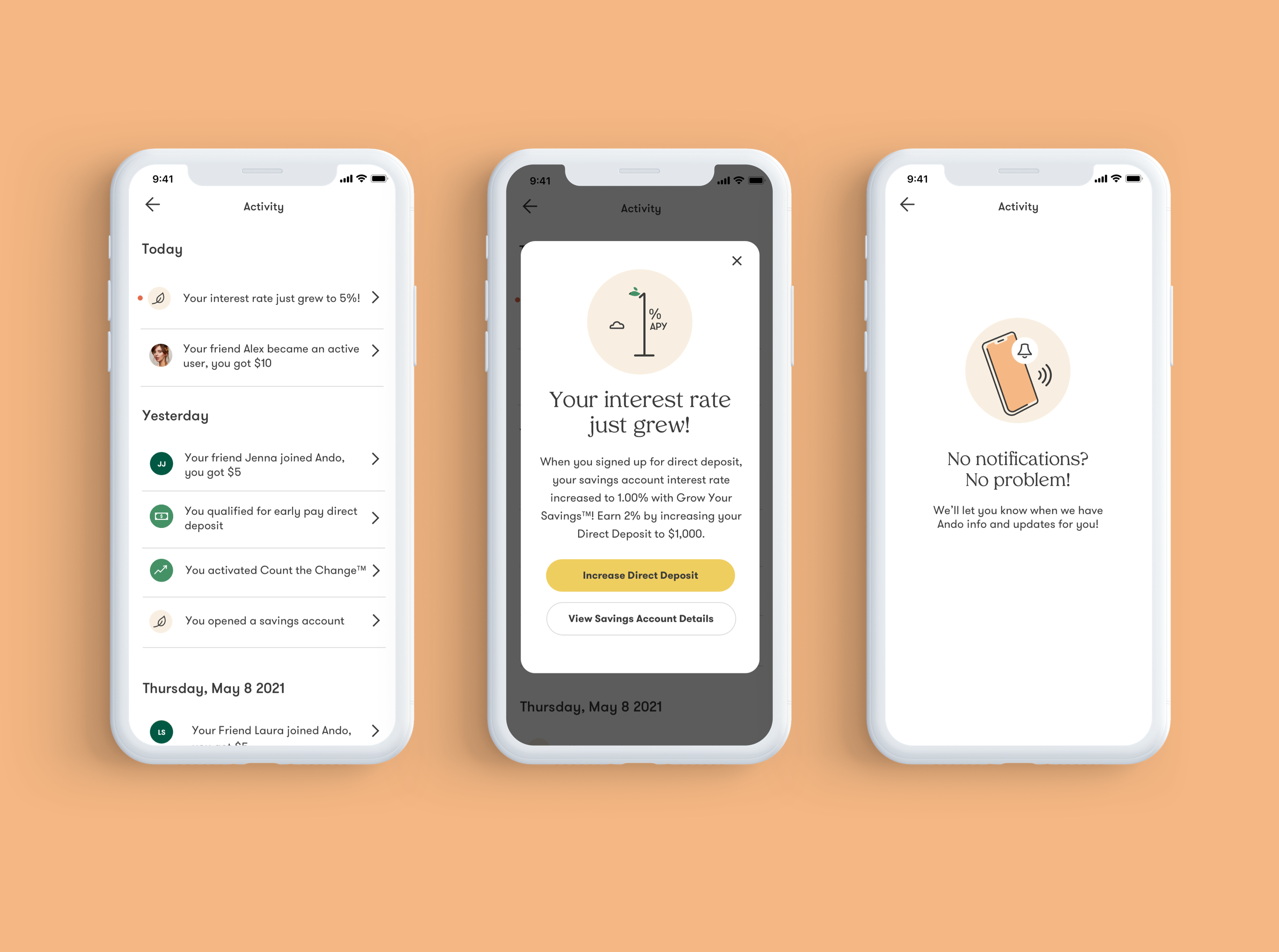
As the first feature that had various communication needs as a user earned or lost their boost, we identified the need to have all in-app notifications in one place. As we increased communication through in-app notifications and push notifications, a new activity center would help users keep track of what’s new.
As someone who loves designing micro-animations, I helped design and animate the notification alert to the right.
Give/Get Feature
We were tasked with launching a new referral program where users could earn up to $15. Coming SoonImpact Center Update
We were tasked with reimagining the Impact Center to show how users could earn cash while reducing emissions.Coming Soon
View Next Project: Sea Ray Website
